
Accessibility is one of those words everyone agrees with and few teams can define. Is it about screen readers? Legal compliance? Ramps and lifts? It is all of these, and it is more practical than most people think. This guide explains what digital accessibility actually means, who it serves, why it now matters legally and commercially, and how you can test your own website in about 20 minutes, without special software.
What is accessibility?
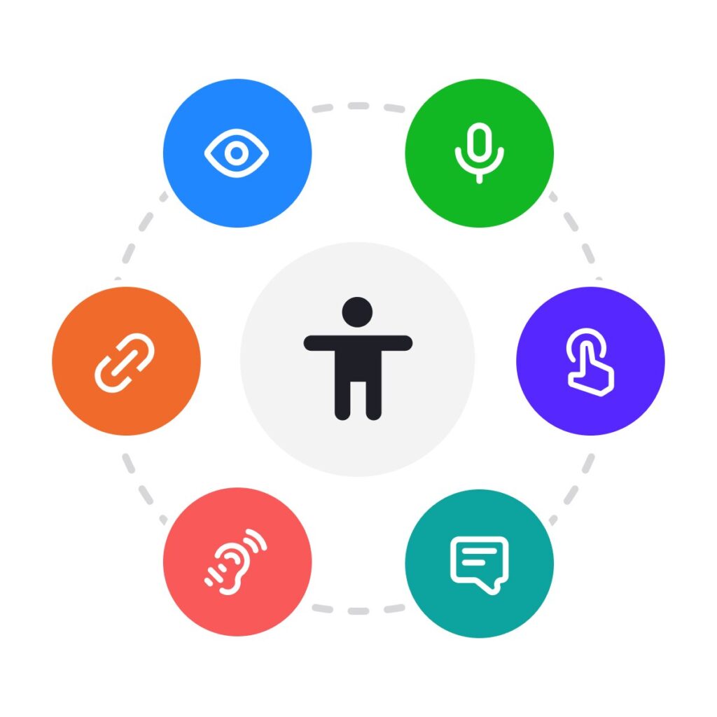
Accessibility means designing products, services and environments so that people with disabilities can use them independently, effectively and with dignity. In the digital world, that covers websites, mobile apps, documents, software, kiosks and the content inside them.
A useful way to think about disability is that it often happens at the point where a person meets a badly designed environment. A blind person is not “unable” to read a web page; the page is unable to communicate with their screen reader. Fix the design and the barrier disappears. That is why accessibility is a design and engineering discipline, not a charity project.
Permanent, temporary and situational
Accessible design helps far more people than those with a permanent disability:
- Permanent: someone who is blind, Deaf, has one arm, or lives with a cognitive disability.
- Temporary: someone with a broken wrist, recovering from eye surgery, or with an ear infection.
- Situational: a parent holding a baby in one arm, someone reading a phone in bright sunlight, or a commuter watching a video without sound.
Captions designed for Deaf viewers are used by millions of people watching videos on mute. Good contrast designed for low vision helps everyone outdoors. This is often called the “curb-cut effect”: features built for disabled people end up improving the experience for everybody.
Who benefits from accessibility?
According to the World Health Organization, an estimated 1.3 billion people, or 16% of the world’s population, experience a significant disability. That is roughly one in six people. The number is growing as populations age, because many people develop vision, hearing, dexterity or memory difficulties later in life.
Digital accessibility matters for people with:
- Visual disabilities, including blindness, low vision and colour vision deficiency. Many use screen readers such as JAWS, NVDA, VoiceOver or TalkBack, or screen magnification.
- Hearing disabilities, who rely on captions, transcripts and visual alternatives to sound.
- Motor and dexterity disabilities, who may use a keyboard only, switch devices, voice control or eye tracking instead of a mouse or touch screen.
- Cognitive, learning and neurological disabilities, such as dyslexia, ADHD, autism, memory loss or epilepsy, who benefit from clear language, predictable layouts and no flashing content.
- Speech disabilities, who need alternatives to voice-only interfaces and phone-only support.
Why accessibility matters now
It is increasingly the law
Accessibility has moved from “nice to have” to a legal requirement in many markets:
- United States: the Americans with Disabilities Act (ADA) is regularly applied to websites and apps, and Section 508 requires federal agencies to buy and build accessible technology.
- European Union: the European Accessibility Act (EAA) has applied since 28 June 2025 to many private-sector products and services, including e-commerce, banking, e-books and transport. The technical benchmark is the harmonised standard EN 301 549, which incorporates WCAG.
- India: the Rights of Persons with Disabilities Act, 2016 requires accessible information and communication technology, and government websites follow the Guidelines for Indian Government Websites (GIGW).
It is good business
An inaccessible checkout, booking form or support page simply loses customers, and those customers usually do not complain; they leave. Accessible sites also tend to perform better in search, because the things that help screen readers (clear headings, descriptive links, text alternatives, logical structure) are the same things search engines use to understand a page.
It is a marker of quality
Accessibility problems are usually quality problems in disguise: missing labels, broken focus order, unclear error messages and inconsistent components. Teams that build accessibly tend to build more robust, maintainable products overall.
WCAG in plain language
The Web Content Accessibility Guidelines (WCAG), published by the W3C, are the international standard for digital accessibility. The current version, WCAG 2.2, became a W3C Recommendation in October 2023 and added nine new success criteria, mostly around focus visibility, target size, dragging movements and accessible authentication.
Every success criterion has a level:
- Level A: the minimum. Failing these blocks some users completely.
- Level AA: the level most laws and policies require, including the ADA guidance, Section 508, EN 301 549 and GIGW. This is the realistic target for most organisations.
- Level AAA: the highest level. Useful to aim for in specific areas, but not required as a whole.
The four POUR principles, with real examples
All WCAG success criteria are organised under four principles, often remembered as POUR. Here is what each one means in practice.
1. Perceivable: can people get the information?
Information must be available to at least one of a person’s senses. In practice:
- Every meaningful image has a text alternative that says what it shows or does (1.1.1 Non-text Content). Decorative images are hidden from screen readers.
- Videos have accurate captions, and audio has a transcript.
- Text has enough contrast with its background: at least 4.5:1 for normal text and 3:1 for large text (1.4.3 Contrast (Minimum)).
- Colour is never the only way information is shown, such as a red border alone for an error.
2. Operable: can people use the controls?
Every function must work with different input methods, not just a mouse or a precise finger tap:
- Everything works with a keyboard alone, and focus never gets trapped (2.1.1 Keyboard).
- A visible focus indicator shows where you are on the page.
- Users get enough time to read and act, and can pause anything that moves or updates automatically.
- Touch targets are at least 24 by 24 CSS pixels, or have enough space around them (2.5.8 Target Size (Minimum)).
- Nothing flashes more than three times per second.
3. Understandable: can people make sense of it?
Content and interfaces should be clear and predictable:
- The page language is set, so screen readers pronounce words correctly.
- Form fields have visible labels and instructions before people start typing.
- Error messages say what went wrong and how to fix it, next to the field (3.3.1 Error Identification).
- Navigation and components behave consistently across pages, and nothing changes unexpectedly when a field receives focus.
4. Robust: will it work with assistive technology?
Content must work reliably across browsers, devices and assistive technologies, today and as they evolve:
- Use native HTML elements, such as real buttons, links, headings and form controls, wherever possible.
- Custom components expose their name, role and state to assistive technology (4.1.2 Name, Role, Value).
- Status updates, such as “Item added to cart”, are announced without moving focus (4.1.3 Status Messages).
The six most common accessibility failures
Every year, WebAIM tests the home pages of the top one million websites. The WebAIM Million 2026 report found detectable WCAG failures on 95.9% of home pages, with an average of 56 errors per page. Just six types of issue accounted for 96% of all detected errors:
- Low-contrast text, found on 83.9% of home pages.
- Missing alternative text for images, on 53.1%.
- Missing form input labels, on 51%.
- Empty links (links with no text, often icon links), on 46.3%.
- Empty buttons, on 30.6%.
- Missing document language, on 13.5%.
The good news is that every one of these is easy to fix. If you only address these six, you will remove the barriers that most people encounter most often.
How to test your website in 20 minutes
You do not need a full audit to find your biggest problems. This quick routine catches a large share of real-world barriers:
- Run an automated scan (3 minutes). Use a free tool such as WAVE or axe DevTools. Automated tools only catch part of the problem, often estimated at around a third of issues, but they find the obvious ones fast.
- Put the mouse away (5 minutes). Use only Tab, Shift+Tab, Enter, Space and the arrow keys. Can you reach every link, button and form field? Can you always see where focus is? Can you open and close menus and dialogs?
- Zoom to 200% and 400% (3 minutes). Text should get bigger without content overlapping or disappearing, and at 400% the page should reflow into a single column without horizontal scrolling.
- Check contrast (2 minutes). Use a contrast checker on body text, links, buttons and placeholder text.
- Listen with a screen reader (5 minutes). Use NVDA (free, Windows), VoiceOver (built into Mac and iPhone) or TalkBack (built into Android). Navigate by headings. Do images, buttons and form fields make sense when you hear them?
- Submit a form with mistakes (2 minutes). Are errors clearly explained, linked to the right fields, and announced?
Nothing replaces testing with disabled users themselves, but this routine will tell you very quickly whether your site has fundamental problems.
Four myths about accessibility
- “An overlay or widget will make us compliant.” It will not. Overlays cannot fix inaccessible code, and they can interfere with the assistive technology people already use. In 2025 the US Federal Trade Commission ordered one overlay provider to pay $1 million over misleading compliance claims.
- “Accessibility is only for blind users.” Screen reader users are an important group, but keyboard users, people with low vision, Deaf users and people with cognitive disabilities are affected by many more issues.
- “Accessible design is boring.” Accessibility constrains a few choices, such as contrast and target size, but it does not dictate style. Many of the most admired digital products are also highly accessible.
- “We will fix it at the end.” Retrofitting is the most expensive way to do accessibility. Building it into design systems, components and acceptance criteria from the start costs far less.
Where AI fits in
AI is already improving accessibility: automatic captions, image descriptions, plain-language summaries and smarter voice control are helping millions of people. But AI-generated alt text and captions still make mistakes, and an AI tool cannot make an inaccessible product compliant on its own. Use AI to speed up accessibility work, and keep a human reviewing the result.
Conclusion: accessibility is how good products are built
Accessibility is not a separate feature, a legal checkbox or a favour to a small group of users. It is a way of building digital products that work for the widest possible range of people, including your future self. Start with the six most common failures, build the 20-minute test into your routine, and make accessibility part of how your team defines “done”.

Pingback: The Promising Future of Web Accessibility: Trends, Challenges, and How Professionals Can Prepare for 2035 - rehanusmani.in
Pingback: Audio-First Design Heuristics for Accessible Interfaces
Pingback: AI in 7 Industries and What It Means for Accessibility
Pingback: Skip Links Guide: How to Build and Test Them (WCAG 2.2)
Pingback: Colour Contrast Accessibility Guide: WCAG Ratios, Tools and Fixes